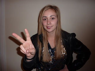

We have chosen the top image to use on the inside of our digipak because it is the softer one. Her expression is alot softer and she had a cheeky smile on her face, which will mean people that have bought her album will see the softer more relatable side of her. Its a good photo as the light is evenly across her and the "v" sign is noticable and prominant. We have also decided to use only her hand from this picture doing the "v" sign so as to be eye catching and different to the other covers, and also to establish the "v" as her trademark. the shadows in the background arent a problem as they can be photoshopped out and so can any other discrepancy.
We are going to use the second picture on our magazine advert as it shows the more edgier side of her, and its important that the customers see that she can evolve and she does have a more rebellious side. It is also more ey catching to have as an advert as its long ways and the pose she is doing is as thought shes looking up to the reader and daring them. Again the lighting is good, and we think overall the image is effective.
No comments:
Post a Comment