Tuesday, 12 January 2010
final video and analysis
Storyline
The plot line of the video is that the main character wakes up in the morning with her friends in the bed beside her, she's confused, and then gradually starts to remember the night before. At this point the video goes into flashback from the night before of when the character was trying to get a taxi. She wins money on the Vegas slot machines and is happy, messing about with her friends by the fountain and everything is seemingly good. They take a picture which brings her back to the present, and while shielding her eyes from the light, she notices a ring on her ring finger. This sets off another flashback and she remembers that the night before she was happy about the ring. Then as they're drunkenly taking a picture the main character throws a coin into the fountain and this is when the story-line takes a turn for the worst, and her luck goes back. She gets her heel stuck in the drain, and argues with her boyfriend. The reverse of the coins in the slot machine is them losing their money in the whirlwind of Vegas, and the main character goes to a club to drown her sorrows. They are both upset and angry, and at the end bump into each-other. The boyfriend shows her a picture from earlier and they walk off hand in hand. The last shot is of the main character opening her eyes, and is back in the present. The idea is to portray the ups and downs of Vegas and the experience it can bring and is a representation of life itself. It tells the tale of the song itself, and is more of a story than obvoiusly being a music video. We wanted the audience to go throught the emotions with the characters and felt that shots of the artist singing would take the reality away from it.
Analysis
The video begins with a tilt shot of the fruit machine, this is because it is a popular association with gambling, and thus Vegas, and gives the audience an immediate idea of what the video is about. It also coincides with how the song starts and the coins dropping from the machine, once the viewer has seen the video once, they will know immediately what it is as they see the slot machine. The first person they see is our artist, they know she is the main character already and are focused entirely on her and are immediately drawn in to the video and storyline when she mimes “you gotta help me out”. She’s looking straight into the camera and it’s as if she is asking the audience to help her out therefore engaging them. The camera then pans around her to see her staring ahead almost in disbelief and also gets a bit if the scene around her in. The next shot is a medium shot of her in the bed and is cut so she turns her head in sync with the music. The medium shot helps establish the scene, and gives the audience an idea of where she is and what’s happened. As she looks back towards the camera, a fade out indicates a flashback, and she is now remembering the night before. She’s on a busy, lit up street, with lots of lights in the background and tries to get a taxi as the lyrics say “we need a taxi”, the medium shot enables the audience to see her facial expressions, and know that they’re in an argument. The shot then changes and the audience get to see the other character in an over the shoulder shot of her boyfriend, and clearly the argument is escalating. She storms off and barges in-between a couple as the lyrics say “spare me your freaking dirty looks”. At this point a close-up of the fruit machine shows she’s won, and a change of location sees her in her hotel room celebrating and change in lighting from dark to very bright reflects her emotions. To separate this scene a little, there is a reverse clip of a pack of cards, which again is a representation of gambling and Vegas. The cards are going from the floor into her hands as an indication of the control she has and how things have gone right for her. A spinning shot and a reverse spinning shot in with another shot of cards all in quick succession, all give the idea of the whirlwind of Vegas and the extent of the money she’s won. As the chorus kicks in the scene changes and the reverse shot of two characters jumping on the fountain acts as a build up for the beat to drop, and when it does they land on the floor. The location is glamorous, by a huge fountain lit up and exciting. All the characters are happy, and the main character and her boyfriend are laughing and joking and getting on well because of the money, this indicates a huge change in mood, and can be seen as the quiet before the storm, or the build up to the disequilibrium. The camera spin is an indication of the crazy, fun times they’re having and the blur of it, and all the lights work well and signify the Vegas nightlife. Then as the line of the song changes and says “get up” the shot changes to the two girls dancing and the main characters head flings back in sync with the song. As they have a picture together the camera flashes and the flash brings our artist back to the present, and she is therefore back in the bedroom shielding her eyes from the light, which is a good link. She notices her ring on her finger as she sings “did we get hitched last night?” A long shot establishes the scene again and as she’s moving her hand up to her face she begins to remember the night before again. A close-up of her hand shows the audience the ring, and they don’t know which time period she’s in until she brings it up to her face and the camera follows it to see her and her boyfriend happy about it in the moment. She puts the phone down as the lyrics say “don’t call your mother” but nothing can dampen the mood as they walk of happily together. The camera shoots them from inside the phone box to separate the shots and gives the audience a different angle. They walk towards their friends and as the chorus comes in the shot changes to in front of them, and they all walk off laughing together. The view is now blurred and indicates the mood of the characters, they’re all drunk and the main character is trying but failing to take a picture. The shot un-blurs as she hands it to someone with a clearer state of mind and the camera quickly zooms in to indicate the picture being taken and something drastic happening, and also goes with the beat of the song dropping. A close-up of a hand flicking a coin puts all the audience’s attention on it and another close up of the coin shows it landing in the fountain. The flash then indicates something happening but the viewer doesn’t quite know what at this point. This is when all their luck goes bad, and begins when the main character gets her shoe stuck in the drain, they begin to argue again, and this is highlighted when they walk either side of the camera and the other couple walk by hand in hand. As they walk up the stairs the main characters boyfriend falls over while the other couple are dancing and happily together. The next shot is of the main character Ricole looking down at her boyfriend and miming to the lyrics “don’t be a baby remember what you told me” In slow motion to go with the slowing of the song and the calming of her emotions. As the song calms down, so do they, and Ricole is trying to make peace and little details like their being a sign that reads “hope” in-between them are to give hope to the audience that all is well. The scene cuts away as she finishes each line, back to when they were happy and is her remembering those times and trying to get him to. However all is not well, and a long shot shows him push away her hand to the beat and them walk in their separate directions. Over the shoulder shots of Ricole arguing again portray her angry emotions and a low angle shot of the other couple standing together indicate their happiness and therefore superiority over the other relationship. The reverse shot of the money indicates them losing it all, and their luck also when the cars move inwards and close. A shot of the happy couple show a huge contrast as Ricole walks into a club on her own to drown her sorrows. The street is full of people, lights and even fire, all things associated with glamour and Vegas, and the hope sign can be seen above the flames, but now she is alone. She is now walking through the club, and everyone else is only just seen in the dark, but she is lit up, the spotlight is on her to indicate how alone she feels but also to put all the attention on her. Clips of them kicking cans, and punching walls show how upset, angry but also in sync with each other they both are, and him walking away from the hope sign show how they’ve both gone their separate ways. At this point the audience is curious as to if they will be together again. Then the camera is on a corner of a street and suddenly the two characters walk into the shot. They both look down and upset and bump into each other. A medium shot helps put the attention on only them and eventually they walk off into the distance. They reunite with their friends and are walking towards a street lit up and with “love” and “hope” signs high above them, as the song comes to an end, Ricole opens her eyes and the video fades out.
What could we have improved on?
The idea of the narrative for our video was that the couple and the trip they are on was full of harmony and happiness; they win the money and everything’s good, until they flick the coin in the fountain. However as we didn’t have enough footage of them being happy together and enjoying the trip we had to replace it with the left over footage we had of them arguing. From 20 seconds in the video is where we had to put this footage, and it confuses the storyline and makes it hard to understand. The audience don’t seem to get the idea of the coin bringing bad luck, as they were arguing before the fountain scene. We could have avoided this by planning our filming better, and therefore having enough footage to do what we had planned. I also think we should have made the coin in the fountain scene more obvious, I don’t think one flash was enough to make it clear what was happening. We could have added slow motion as it went into the water so as to focus the attention entirely on it. I also think that by incorporating more things going wrong, it would have been more obvious rather than only her shoe getting stuck and them arguing. But again we didn’t have enough footage and had it been planned better would have been more effective.
I think we could have used the portable light a bit more effectively as well. At 1.05 the way we have placed the light means a shadow is across our main characters face, and it doesn’t look great. Also with the fountain footage, sometimes it’s a little dark and using the light more effectively would have made it clearer.
Other than that i think our video was well thought out, and some of our filming and ideas worked really well. We thought about our locations and I think the ones we picked worked perfectly with what the video was about. The main thing we’ve learned for next time is that it’s important you get a lot of footage of every scene you film, as you notice things only when you see it on the computer that you didn’t realise when filming. We had a few problems with lip syncing being out of time and had we taken alot more footage could have edited it in easily.
Saturday, 2 January 2010
my magazine advert and analysis


After researching magazine advertisements, I saw that the most effectove ones featured one huge picture of the artist, and then the Cd cover on the page somewhere. We decided that because the CD pack itself, didnt feature huge amounts of the artists face, that we would use a picture, mainly of her face, and it would span from the top to the bottom of the page. We wanted it to look like the front page of a magazine, so set it out in that type of format, with our artist being the only one talked about and advertised. The idea is that its a front cover but the only thing worth talking about on it, to draw the readers in, is Carmen Veronica. Half way down, on the left is a qoute from Oprah Winfrey, which of course we would want to stand out alot, and so its in a really bold font, black with a white kind of shadow around it. It is very attention grabbing and stands alone, as nothing else is needed. On the right, opposite the quote, is the album title and a picture of the front cover, so that the customer knows what to look for when they are in the shop. The theme is orange, black, grey and white, to look good and so that it all matches. A huge star pug contains the words "23 hit singles", so that it stands out as much as possible, and a banner across the heading also helps the content stand out. The qoute along the bottom is in the style of banners often at the bottom of magazine covers, and features a quote from someone with a huge reputation. The background is plain white, as there are so many colours on the page, anymore would look overcrowded, and the writing wouldnt stand out as much. The sequence of pictures above shows the editing process and how we got our final piece.
My digipack and analysis

This is our digipack, it features the front cover, the back, and one inside page.
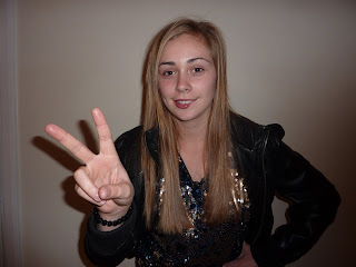
After the analysis of many cd covers, we decided that having a trademark move, or logo, or sign, is a great marketing technique. Jay z has developed his diamond into a world renound logo. Everyone knows what it is, and what it represents and we wanted to incorperate this. We took a picture of our artist doing a "V" sign and played with the brightness and the contrast until we got the right one. It has a orange tone to it, which makes it stand out, and also matches with the orange lights in the background. We chose this background picture as its full of lights and goes with the Vegas, party theme. We darkened it a bit and increased the contrast so that the lights were bright, but the rest was dark so that the hand stands out. We thought this sign was appropriate as the song were doing is about Vegas and is the title track of the album. The album is called "waking up in..." and the "V" represents Vegas. The v will be a huge feature of the campaign, and will be developed into the artists trademark. The title of the album is underneath the hand so its the second thing that catches the customers attention. Its very plain so that theres not too much colour, and the artists name is small, which looks neat and tidy, and is not the main focus. The album cover is focused on the album itself, and not so much the artist, this gives the image that the artist is enough in their own right to sell the album, and doesnt have to be forced upon people for them to remember her.
Next is the back. We decided that because of all the different colours on the front cover, we would tone it down, and go with plain black and white. To jazz it up a bit, we wrote the titles of the track in a circle. Its kind of a statement saying "the most important thing is the music". The focus is on nothing else here but the music itself. The font is the same as the front cover, to continue the theme and the copyright is listed at the bottom, so it can be seen, but is not stealing any attention. The label logo we made is neatly to the side, so again, it can be seen if people are interested, but is also not a main focus. The barcode, is in the corner out of the way.
The spines, where the digipack folds, have a orange and white, funky background, to keep with the orange theme, and are bright and eye catching, if the cd is lined up against other, so it stands out. Again, the font if the same, and in black, to stand out.
The inside page, is the first time a picture of the artists is seen. Shes doing the V sign, to try to establish that, and keep that going. The heading, is in a different bold font, so that it makes a change and kind of detached itself from the rest, to get the customers interest. This time, the artists name is at the top, and grabs the attention of people, it is advertising a tour, and so the idea is to get people to notice it. Behind it is a spade, which represents Vegas, as playing cards are one of the things that Vegas revolves around. This is to give the customer a clue as to what the tour is based on. Directly underneath is a list of the tour dates, against the black background, so they are clear and easy to read. Placed across the artists hand is a lyric from the title track, so people recognize it and associate it with the tour, and to get them kind of picturing the song being performed. The artist is wearing a bright, sequined top, which stands out, and continues the party/Vegas theme. At the bottom is the albums producers, so they can be seen, and any big names recognized, but are not a main focus.
CD magazine advert analysis

This is a magazine advert, for gwen stefanis album. The image of her covers the whole page, so the audiences attention is entirely on her, which is an idea we plan to use. It is very colourful and eye catching, so they cant fail to notice her, with her name in a big, bold font stretching across the page. It, like ours, is a glamorous theme, and is emphasized by the jewels in her hand, and the swirly gold lettering. We hope to make our theme as bold, and obvious as this. It also features a small picture of the akbum cover at the bottom, to familiarise people with it, so they know what it look slike to buy it. This is another tactic we will use.
Images for digipak and magazine advert

We have chosen the top image to use on the inside of our digipak because it is the softer one. Her expression is alot softer and she had a cheeky smile on her face, which will mean people that have bought her album will see the softer more relatable side of her. Its a good photo as the light is evenly across her and the "v" sign is noticable and prominant. We have also decided to use only her hand from this picture doing the "v" sign so as to be eye catching and different to the other covers, and also to establish the "v" as her trademark. the shadows in the background arent a problem as they can be photoshopped out and so can any other discrepancy.
We are going to use the second picture on our magazine advert as it shows the more edgier side of her, and its important that the customers see that she can evolve and she does have a more rebellious side. It is also more ey catching to have as an advert as its long ways and the pose she is doing is as thought shes looking up to the reader and daring them. Again the lighting is good, and we think overall the image is effective.
cd cover analysis

This cd cover is the opposite to the one analysed below. The focus is entirely on the artist. The background is a wishy washy grey colour, which is bland and helps keep the attention on her. The name of the artist is the next focus point, in a girly font, and white, so it stands out againsts her. Its not at the very bottom of the page, so that its high enough for people to notice straight away. She is a new artist , so the cover is designed to establish her as a person, they want poeple to see her face, and recognize it. It is a different marketing technique to the one below, its very soft, and they are marketing the album on her face, shes a pretty girl and they want this to be the main focus.
cd cover analysis

I chose to analyse this cd cover as it doesnt feature the artists face. These ones are always interesting as their are few of them, most covers focus entirely on the artists face and image. Usually the motive of this is to develop some kind of trademark that is instantly recognisable, for example the Rolling Stones cover featured earlier. This cover, if looked closely at, also has this motive, as below the title of the album, they have encorperated the sign that is associated with the band. After doing some research, at all of this bands gigs, they do this sign to the crowd and it has become a staple. It is a great marketing technique, and also helps the main focus be the music itself rather than who sings it. The title of the record is in big, bold, eye catching font and colour. The colour starts of quite dark purple, and then changes to a bright blue at the point it reaches the bands sign to really make it stand out. The band name is at the top, in gold, which clashed the colours, and makes it stand out in its own right. Then the background is plain black, so that the writing is as stand out is possible, and is the main focus.
Subscribe to:
Posts (Atom)